Background
I'm an engineer who barely knows any js/ts syntax. I can barely understand what these node.js projects do, and it takes quite an effort.
Luckily, AI is very good at writing js/ts, so I can still build a few simple front-end projects.
Lately I've been thinking about building a large desktop software project from scratch, so I'm going through the whole interaction chain from the outside in. The outermost layer is the UI[^UI] presentation.
Two or three years ago, I used a library:

Through it, I learned about Home - Fluent 2 Design System, and realized that the world has a bunch of well-defined design systems. So now I need to find a sensible one and actually start thinking about how to use it in the UI layer of user interactions.
As everyone knows, Microsoft's UI design has long been criticized. I'm not going to use Fluent, even though I already know a bit about it; instead, I'm diving deeper into the Carbon Design System.
The tip came from a stranger's blog: From the New World #0x15: Carbon Design System | The Gate to the New World.
Carbon is IBM's design system and forms the foundation of its official website, IBM. You can check it out there. Below are the design systems I know at a basic level, along with some of their characteristics.
-Fluent: Microsoft's design system. It has components for most of the ecosystem and is enforced for Microsoft's desktop UWP software. But even its official website doesn't use the design system correctly.
- Material: Google's design system. It has components for most of the ecosystem. Although it's mobile-first, the desktop experience is also good. It feels elegant. The downside is that there are too many versions, all named Material. Some implementation kits follow the old design, which is hard to notice at first.
- Apple: Apple Human Interface Guidelines. Apple only has one set of design guidelines, not a full design kit for all platforms. Much of it only works seamlessly within the Apple ecosystem; on other platforms, you can only find implementations recreated by extremely skilled developers.
- Carbon: IBM's design system. The official kit only covers the web ecosystem. It is enforced on the IBM website and most of its software, and gives a unified but inelegant experience on both desktop and mobile.
Why Carbon
It's a basically complete, enforceable standard. I'm not a professional designer. Even if I have some taste (proud face), it's hard for me to articulate the design I want, so I need enforced constraints to unify the visuals.
Its out-of-the-box experience is pretty good too. Time to drag Fluent again: if you leave its default colors unchanged, it's simply hard to look at. Of course, it also has no enforced color standard.
Material is certainly beautiful too, but compared with Carbon, it lacks a certain hard-edged stability.
Enforced constraints reduce playfulness but also increase the sense of reliability. For industrial UI design, Carbon should be my best choice.
The Purpose of Design
The ultimate goal of UI design is to make users feel it's easy to use, and that can only be truly measured with real user data.
During development, all we can do is try our best to:
- unify the visual experience
- minimize surprise
- guide attention
- support multiple devices
These are the achievable goals I can act on. Below, I'll evaluate the Carbon I use against them.
Learning while using it
Elements
2x Grid
The core concept of the 2x Grid is multiplying or dividing by two to create visual rhythm. Fluid grids are built through division, while fixed grids are built through multiplication. At breakpoint boundaries, these sizes match.
This is a typography-related requirement. You can see it on the official site: apart from hero content, all other containers are aligned.
It also requires layout to be multiples of 8px, and provides several reliable reference presets.
Color
The applied color palette brings a unified and recognizable consistency to IBM's digital products and interfaces. This consistency is based on a clearly defined set of rules for how the Carbon component library is used in dark and light themes.
This color system is deliberately limited and non-arbitrary, and it's used across all interfaces and components. It delivers a unified color experience—very rigid, but indeed minimally surprising.
On the IBM website, apart from hero sections and videos, the colors of all text and component content come from about a dozen predetermined colors.
This is the color system I've studied most deeply and actually implemented in the homepage project. You can see the extracted variables in carbon-vars.css.
Icons
No need to say much—it's just an icon library. Carbon is open source, so you can use them directly.
Pictograms
A library of large-size icons.
Motion
A few motion curves, although I haven't seen where IBM actually uses motion.
Other
Still learning.
Guidelines
Accessibility
The accessibility guidelines explain how to support users in different environments and with different limitations.
They explicitly require keyboard-navigation support and explain how to achieve it through enforced rules. In practice, pressing the Tab key moves through every interactive component, and each component must provide corresponding visual feedback.
You can try this on the IBM or Apple websites—they genuinely do support it.
Other
Still learning.
Components
Overview
Just look at the overview to understand the components, and appreciate Carbon's design philosophy from the implementations.
Dragging Fluent again: what's shown in its overview is completely different from the demos on its component pages.
The Button demo here shows the difference between light and dark themes. The best part is that the component colors remain the same in dark and light modes and still produce a good visual result.
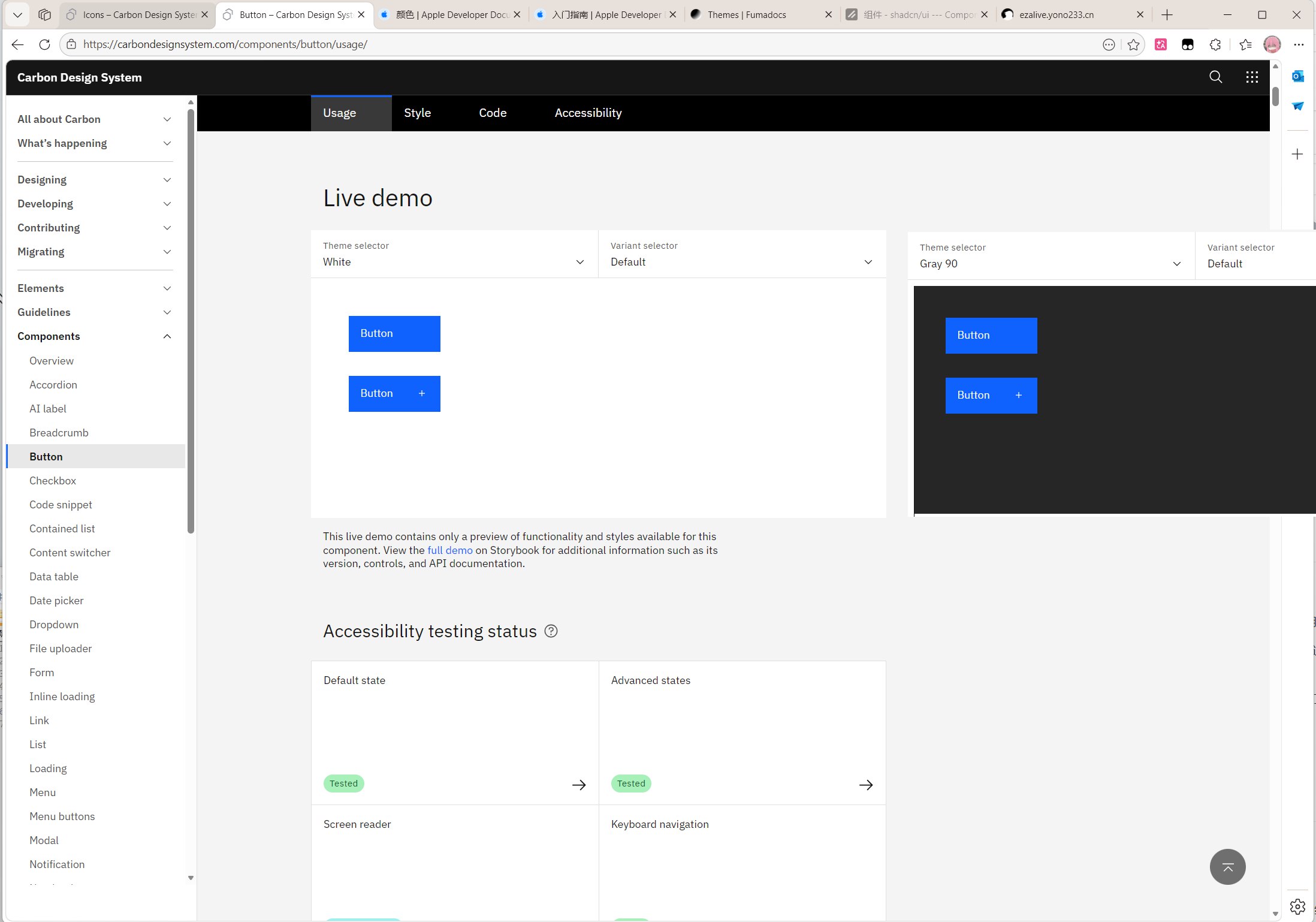
IBM_BUTTON
Patterns
Still learning.
Side Notes
Carbon is probably the only modern design system that is extremely restrained in its use of rounded corners.
You can apply for access to Carbon MCP. I got permission about two weeks after applying.
Because I didn't read and accept the license agreement in advance, it took two email exchanges to get the authorization code. If I had accepted the agreement in advance, I would have gotten it several days earlier. Carbon MCP & Early Cloud Services
- UI: User Interface (UI) refers to all the visual and auditory elements involved when a user interacts with a computer or other electronic device, including screens, menus, buttons, icons, text, audio, video, and more. UI design is the process of designing these elements as a whole, with the goal of improving the user experience and letting users complete operations easily and intuitively.Returnui